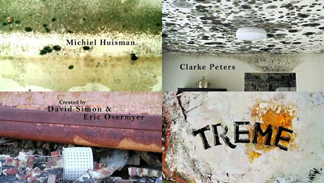
One of the reasons I like following former Michiko Kakutani, former New York Times book critic, on twitter is that she frequently posts good artwork. I liked to use the following thread to post artwork and examples of design that we like. Here’s one to start. This is from the title cards from the opening credits of the HBO TV show, Treme. Treme takes place in post-Katrina New Orleans, and the background to the title credits are basically images of water stained, moldy, damaged walls.
Whoa. Okay, sorry I wasn’t clear about this before, and sorry I didn’t have the mechanism (for comments) in place yet with this site revamp, but we do not link directly to images hosted on other sites. It’s a huge breach of netiquette. Basically, every time a post loads with an image taken directly from someone else’s site, we’re using the other site’s bandwidth, and while that’s a negligible amount of data for a little site like ours, it’s still suuuuper uncool.
For placing images in posts (like yours), when you’re composing the post, click “add media” from the button bar at the top of the editing window. If you are logged in to VI, you can upload images right from your computer (or phone or tablet). So for the image you shared here, download the image first from the host site, then upload it to VI’s server with that “add media” button. After you’ve uploaded the image, some options will pop up in a right sidebar, including “insert into post.”
I’ve already edited your post using this method, but feel free to try it for practice.
To leave images in comments, I’ve added an updated version of the plugin that let us do it before, and this works a lot better. As you’re typing in a comment, you’ll see “select an image for your comment” beneath the comment window, with the familiar “choose files” button, which works like other websites you’ve used. Again, the image has to first be on your computer (or phone or tablet). Clicking “choose files” will let you upload, and it will insert the image in your comment. I just did a test run with an image from ABC’s Fresh Off the Boat and it worked unexpectedly well.
Please let me know if you have questions or problems.
I don’t follow this Twitter account but someone I do follow retweets it often. It won’t all appeal to you, but I’m impressed sometimes with the stuff it shares.
Shoot, I didn’t realize you edited the image, and I deleted it already. Anyway, sorry about posting the image. I’ll try to do so using the proper method from now on.
The nice thing is that even though you edited the post, the image was still in our image library from when I uploaded it earlier. So I just put it back in your post.
Oh, one more thing. My web server has a weird caching issue that I’ve been unable to solve. Sometimes when you try to upload photos, it doesn’t work. If that happens, let me know, and I’ll reboot the sever, which clears the cache of temporary files and lets us upload correctly. For future reference.
You sure uploading images is safe? I feel kinda wary about bringing something bad on the site.
images are totally benign unless there’s something yucky in the photo itself.
How do I download images to my computer?
When you see a photo you want to download, right-click it (if you’re on a PC; if you’re on a Mac, ctrl-click or apple-click; I can’t remember which) (if you’re on a tablet or smartphone, touch and hold, then choose “save photo”). You’ll get a pop-up menu. Choose “save image as” and tell it where to put the image. I usually just put it on my desktop since once I upload it, since I’m probably going to delete it anyway.
This is useful stuff! You can fill in all the missing artwork in your iTunes, although I’m guessing you don’t care about that if you haven’t asked already. You can change the desktop wallpaper on your computer, phone, or tablet. You can make your slide presentations more interesting. You can save interesting stuff in one place so you don’t have to look for it all over the web. You should just do it now so you know how to do it. Your son probably already does.
The message I get is, “save image as.” That’s the one, right?
I do care about the doing this for itunes, but, in the past, I just copied the image and pasted it in itunes. (I recently tried this and it didn’t work, so I’ll try the method you described above. Thanks!)
Yes. Save image as.
I liked Eddie Van Halen’s guitar, which is why I kinda like this cover:
It is a great cover, despite not including the VH logo. It says a lot about the band’s identity (as Edward’s band), and that guitar design is iconic even though he didn’t play that instrument for very long. It’s really a fitting jacket design.
Sticking with the cover art theme. Blue note has a lot of cool covers. Here’s one I like:
I like what I’ve seen of Mirtha Dermisache’s art. You can see some here in this Paris Review article
I wouldn’t say this is the most brilliant art work I’ve seen, but it’s cool.
One of my favorite patterns in Christopher Alexander’s Pattern Language is the farmhouse kitchen. Here’s part of Alexander’s description:
I have a hard time finding examples of this, but here’s one, from the movie The Big Chill that comes close:
I kinda like this from Moonstruck, too:
I was going to put up a bunch of photos of kitchens from Nancy Meyers films, since that’s what I immediately thought of when you posted this (especially It’s Complicated), but then I found this article ranking the top 5 Nancy Meyers kitchens. I have a feeling this is slightly different from what your guy is highlighting, but there’s no question that kitchen design (set design in general) is a Meyers signature, almost as much a part of her style as it is Wes Anderson’s.
Pretty nice writing in the piece, too. I like the voice.
I like the kitchens/dining rooms in Meyers’ films. I had no idea both were a “thing.” However, you’re right–her kitchens/dining rooms are a bit different. One thing that I don’t care for–those island tables, or whatever they’re called. I mean, I don’t strongly dislike them, but I find them problematic.
I read an article recently about how someone had a kitchen built without an island and she thinks she’s the only person in America who’s built a kitchen in the past 20 years but without an island. Her designer was like, “Where are you going to put the island?”
Oh, here it is. https://www.wsj.com/articles/why-kitchen-islands-are-ruining-kitchens-1522769824
Hm. Looks like it’s behind a paywall. If you click it from within FB, you get to read it though.
On some level, the island concept is not a bad one. And by “island concept” I’m thinking of a surface in the middle of the kitchen used for preparing food, at the very least, but often includes an eating space. Combining the two spaces makes sense, and maybe it can work. Right now, my sense is that putting a dining table is better, while relegating food preparation to counter tops (usually next to walls). My hypothesis is that one of the main problems with synthesizing food preparation with an eating space is that higher counters are more ideal for food preparation–because standing is generally the ideal position to prepare food. But the higher counters make for awkward and uncomfortable eating, leading to taller chairs, which are generally not as comfortable as lower ones. Some islands try to get around this problem by creating a split level–one for food preparation and the other for eating, but, for whatever reason, I don’t think these work very well, either. That’s probably more than you wanted to hear on the subject, so I’ll stop.
No, actually I’m intrigued by the concept. I think kitchen islands are great for people like me who live alone, mostly because facing a counter, I can’t look at my TV. 🙂 But also because I do an embarrassing amount of my dining right where I’m preparing my food, as it’s being prepared. I actually have a dining table in the middle of my kitchen, and I cook my food on the table with a butane stove (long story). It’s a little bit like a yakiniku place. Cook it on the table, then serve it to myself while I’m standing over it.
If you frequently eat standing up then a kitchen island is great.
Richard Serra
The United State Government Destroys Art
1989
These photographs of lava by Bruce Omori are gorgeous.
I thought this was pretty cool:
I tend to think the one below is better, though:
I really liked this painting, “Cracked Ice,” by Maruyama Okyo, which I saw in a documentary. I liked the comments made about it. The documentary used the painting as an example of the way European influences made their way into Japanese painting–in this case the feature of perspective. The historian speaking about the painting said it was one of the best examples of blending styles (or something to that effect), and I can understand why he said that. The painting is from the 18th century, but it has a modern quality, which I like and also find eerie. The historian mentioned the way the painting captured the Japanese (or Buddhist) values of impermanence and imperfection. Yes, it does that well, but in an abstract, modernist way. I also love the title of this.
I missed your San Diego State post and totally agree. It’s the nicest helmet in college football. Maybe in all of football. Their unis are great too.
The night before last, I was on the Criterion website to see if there was any news about the new streaming service (there isn’t), and stopped to look at the 2018 releases. I was on Amazon ordering The Breakfast Club and The Princess Bride in minutes. They get here Friday I think.
This was the Sunday crossword puzzle in the Washington Post on December 23. The constructor, Evan Birnholz, is one of my favorites but I’m not good enough a solver most of the time to actually enjoy his cleverness.
I knew something was up when the clue for 5D was “Actress Long or Peeples.” That had to be NIA, but there are five letters. I found clues for what was going on within the puzzle:
6D was “Fast food symbol associated with one of this puzzle’s special letters,” or GOLDEN ARCHES. I got that one really early in the solve.
100A was “Reporter associated with one of this puzzle’s special letters,” or CLARKKENT. I thought that was going to be super difficult (there are so many reporters!) but the crossing answers made it easy.
85A was “Hunting item associated with on one of this puzzle’s special letters.” I got TREASUREMAP quickly but now I had three clues but no idea what was the gimmick in this puzzle.
Strangely, I managed to fill out the lower right corner, still not knowing what was going on. 94D (“Genre for Easy-E and Jay-Z”) and 116A (“Gomer on an old sitcom”) helped me get there. I was baffled by the clues for 15D, 19D, 113A, 109A, and 120A, which were all (all!) “White Christmas piece, literally.” When I got the lower right corner I just decided to assume all the answers to these clues were a string of empty boxes.
This let me sorta fill in the rest, but the thing that nailed it for me was 14D, “Literary character associated with one of this puzzle’s special letters.” When HESTERPRYNNE fell, it all made sense. That’s A, of course, so the empty squares in one of the corners had to make the letter A. Then the other special clues made sense. TREASUREMAP = X. CLARKKENT = S. GOLDENARCHES = M. The empty white squares made a WHITE X-MAS.
Brilliant construction and design. Took me 41:25, or way too long to think I’m close to ready to enter the American Crossword Puzzle Tournament. The crossword bloggers (writers and readers) seemed to really like this one too.
I keep forgetting to share this here. It’s a TED Talk (and you know I dislike TED Talks) and it’s fascinating. There isn’t anyone I’ve shared this with who hasn’t really liked it.
I’m not what to think of the following, beyond the fact that it’s impressive:
There’s a certain helmet/mask design for superheroes that seems seems really cool, even badass, to a lot of people. The design seems to stem from medieval knights, especially the barbuta(?) design:
Magneto has that type of helmet, and he looks cool because of it, in my opinion:

But Boba Fett takes it to another level:
The one crucial change is that you can no longer see his eyes. (Also, Boba Fett’s uniform and gadgets/weapons were way cool as well.)
There were two possible precursors, or characters that came before Fett, that I really liked as well. One was Cobalt 60 (I thought this was such a cool name as a kid.) from Vaughn Bode’s Junkwaffle comics:
Later, Ralph Bakshi basically ripped off the look, creating the character Necron 99 in his movie, Wizards (I believe Bode sued Bakshi for this, but I’m not sure.):
Another character in a similar vein that I liked is Snake-Eyes from G.I. Joe:
(The original helmet was different, but I had a hard time finding an image of it.)
I also think Deathstroke, the Terminator, has a similar look:
I really like his look. (Later iterations of his mask had the look of a hockey goalie’s mask, which I’m ambivalent about.)
This is similar to Deadpool’s look, but I prefer Deathstroke’s.
One of my ideal locations for a class reunion is a beach house or a house somewhere on Tantalus. With regard to the latter, here’s the look I have in mind:
(I would not want to have a gathering at the Liljestrand House, but if we could find something similar that would be awesome.)